Certificate of Excellence (COE) templates are one of the most popular award types for business professionals and employees. These certificates are offered to employees and executives for recognizing their skills and performances in their respective fields. However, a lot of people do not know how to properly prepare their certificates. So in this post, we have some tips to help you create your own COE and avoid common mistakes in formatting. You can also download free Award Certificate Templates as you would like.
Imagine you’ve just guided a team through a grueling six-week leadership workshop and the participants are beaming with pride, eager for that formal acknowledgment that turns effort into credibility; the same moment arrives when a school celebrates a student’s top-scoring project, or when a nonprofit wants to honor a volunteer’s years of dedication. In each of these real-world scenarios, a Certificate of Excellence becomes the bridge between accomplishment and recognition, yet designing one from scratch can drain time and dilute consistency. This is where professionally designed certificate of excellence templates step in, offering a polished, editable certificate template that you can instantly download, customize, and print as a high-resolution PDF. Whether you’re searching for a free certificate template, a sleek certificate of achievement design, or a printable, custom certificate template for corporate training, these ready-made solutions guarantee a uniform look, boost credibility, and let you focus on celebrating success rather than wrestling with layout details.
Core Elements Every Certificate of Excellence Should Contain
When a Certificate of Excellence is presented, it does far more than simply acknowledge an achievement; it becomes a permanent record of credibility, motivation, and brand identity. To ensure that the award fulfills all of these purposes, each certificate must be built around a carefully considered set of essential components. By weaving these elements together in a coherent design, you not only elevate the perceived value of the award but also guarantee that the document can be easily understood, reproduced, and archived across a variety of contexts—whether it is handed out in a classroom, displayed on a corporate intranet, or mailed to a remote employee.
The Recipient’s Full Name as the Central Anchor
The individual that actually achieved the honor is the core aspect of any certificate of recognition, and hence the appropriate name of the bearer is placed at the very top, in a size slightly larger than the body type, as in a proper title. This layout immediately refocuses attention unto the selected honoree, enhancing any sense of personalized special connection and taking away any room for confusion resulting from the use of a nickname or abbreviation. Upon the preference of a heavier font weight, this would normally offer greater contrast with fine, defined letter shapes, such as serifs for the title and sans-serifs for the name, in order to yield a professional character of the typeface, whereas the name would then stand out, even when it could be reproduced for photocopying or lowered resolution.
A Clear and Descriptive Award Title
Directly above or below the recipient’s name, the award title—commonly phrased as “Certificate of Excellence,” “Award of Outstanding Achievement,” or a more specific variant such as “Excellence in Leadership”—must be unequivocal and succinct. This heading not only signals the nature of the recognition but also provides context for future readers who may encounter the certificate in a portfolio, résumé, or digital badge repository. Incorporating the keyword phrase “Certificate of Excellence” within this heading reinforces relevance for search engines, ensuring that the page’s content aligns precisely with user queries while preserving a formal tone appropriate for business, academic, or nonprofit settings.
A Brief but Meaningful Citation of Reason
The objective of the award should be spelled out simply in a paragraph to explain why the award is being presented to the recipient, ideally mentioning measurable outcomes, a particular project, or an exemplary behavior. Instead of clichés, take in reference a particular sales target that was surpassed, a research paper that received peer-review accolades, a community service initiative that reached a specific number of beneficiaries. This fills out the certificate, so anybody reading it will understand what winning the award means without any other paperwork, but also seeds long-tail keywords that could push the webpage to greater prominence in such niche searches as “employee of the month certificate wording” or “academic excellence citation example.”
The Date of Issuance
Including the exact date—preferably formatted as month, day, and year—provides a temporal anchor that validates the award’s authenticity and aids in record-keeping. Whether the certificate will be displayed on a wall, stored in a digital archive, or referenced in future performance reviews, the date confirms when the achievement was recognized, which is especially critical for programs that reward recurring milestones or for organizations that require proof of continuous professional development. Placing the date near the bottom or in a footer area balances visual hierarchy while keeping it accessible for verification purposes.
Authorized Signatures and Official Seals
A signature on the certificate from one of mankind’s spiffy officials is the item to show the document is not fraudulent but real. Official office holders signing are the best, since they have a professional air about them; more impressive than the average title is to put into place a stylized signature, clearly indicating that it was indeed written by a person; accompanying printed information about the position of the signer confirms the sender’s status within the organization. [bc. 26] Seals, emblems, and watermarks become the main tools fulfilling the standard of a visual proof of authentication, and they serve significantly as deterrents to chicanery. These features, when strategically emplaced around the signature line or in a corner of any certificate form, will not only act as a forceful design pointed at underlining the official purpose of document but also form a composite triangle commemorating authenticity.
Organizational Branding Elements
Finally, the certificate should bear the visual identity of the issuing body, encompassing the organization’s logo, color palette, and any relevant taglines. Integrating these branding components not only reinforces corporate or institutional cohesion but also ensures that the certificate aligns with existing marketing assets, thereby strengthening brand recall whenever the award is displayed publicly. When selecting colors, it is advisable to choose hues that provide sufficient contrast against the background and do not compromise legibility; similarly, the logo should be sized appropriately to maintain visual balance without overwhelming the central content. By weaving branding seamlessly into the design, the certificate becomes an extension of the organization’s storytelling, extending its reach beyond the immediate recipient.
Free Certificate of Excellence Templates
If you don’t have an idea to make a COE, then you can get all the best-created Certificate of Excellence Templates that are free to download. After getting your favorite one, you can easily make changes to its text using its editing facilities.
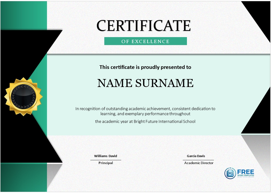
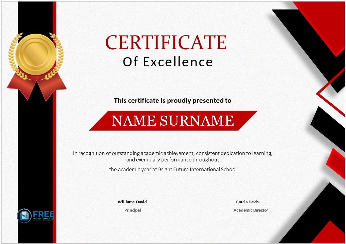
Printable Excellence Certificate Template
File Size: 3 MB
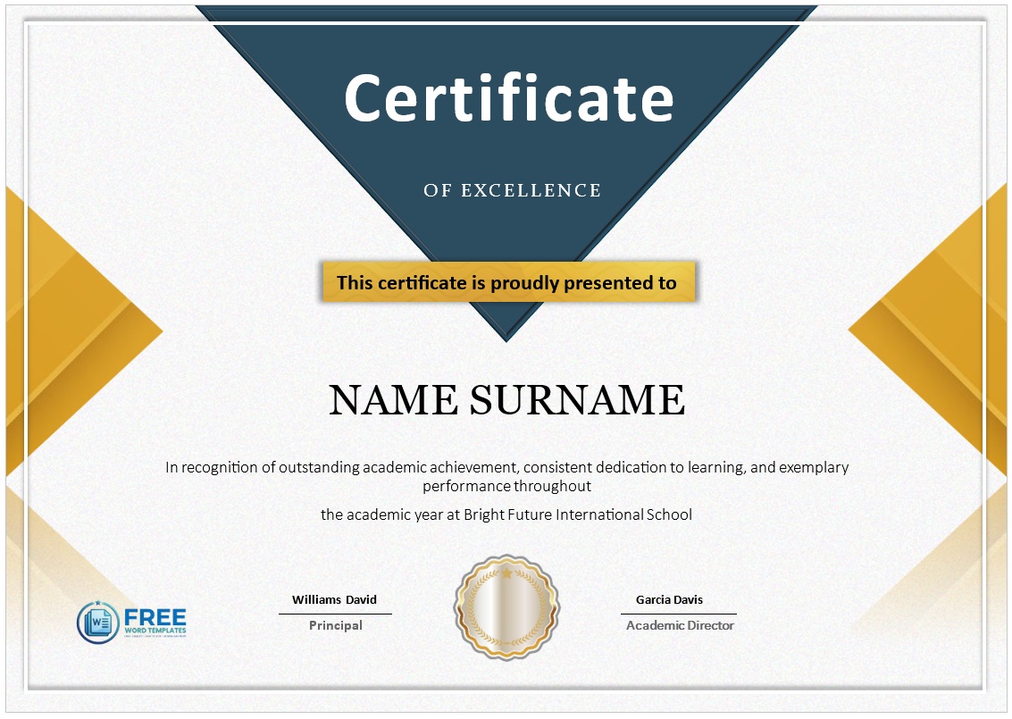
Outstanding Performance Certificate Template
File Size: 5 MB
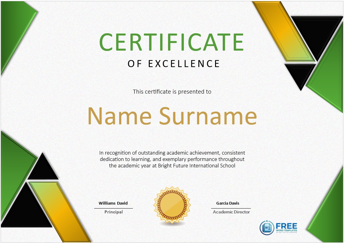
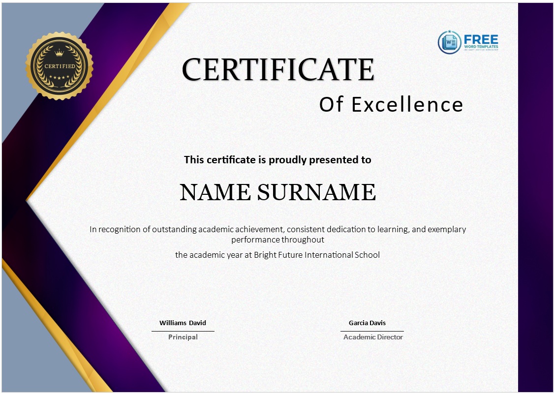
Achievement Excellence Certificate Template
File Size: 3 MB


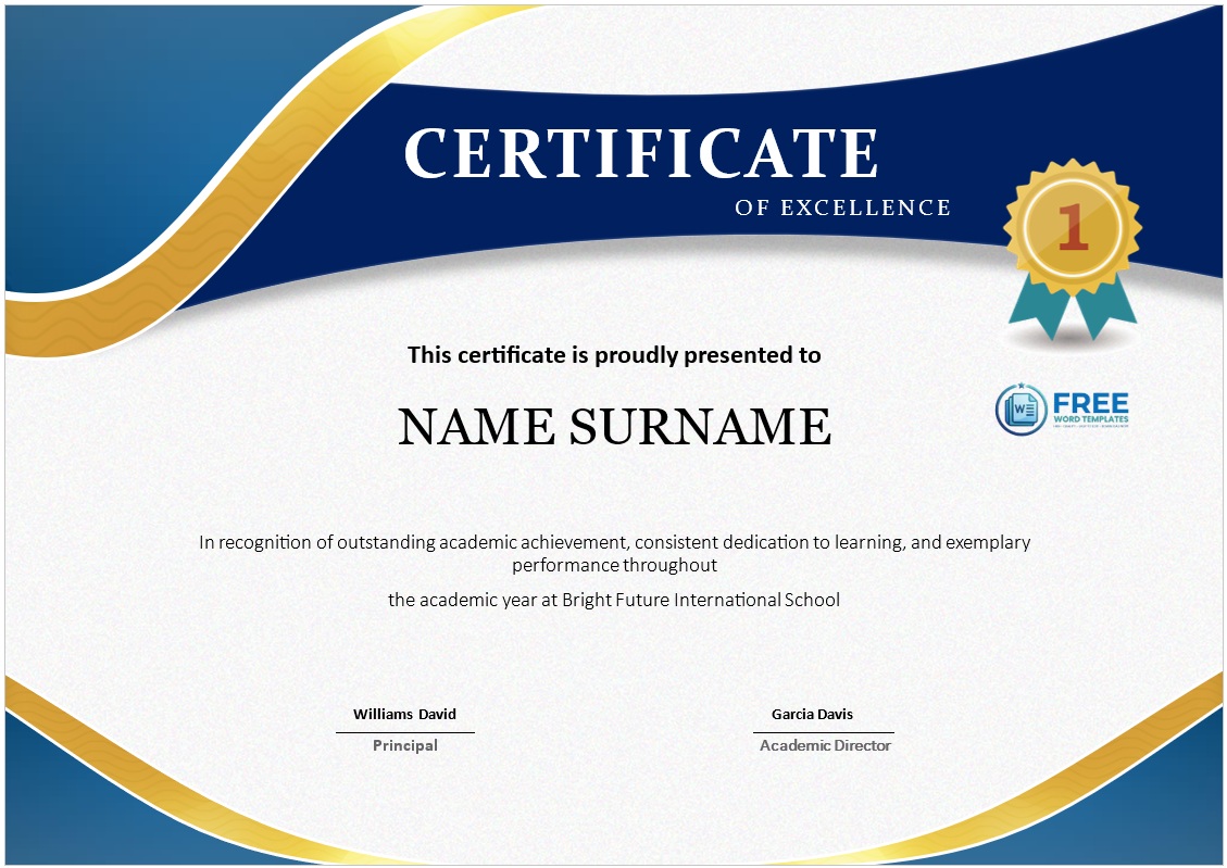
Academic Excellence Certificate template
File Size: 1020 KB


Recognition Certificate for Academic Excellence
File Size: 429 KB


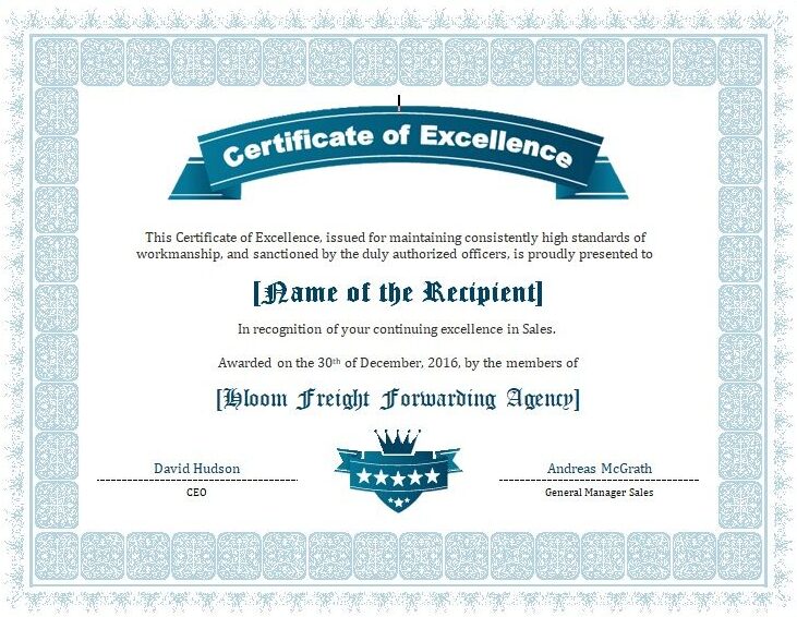
Marketing Excellence Certificate Template
File Size: 81 KB


Format Guidelines for Certificate of Excellence Designs
Every template has specific format specifications to follow. Make sure that your certificate is not missing any important part or portion. Read the tips below:
- Choose the best Printable Template: A lot of experts suggest the use of the Printable Certificate Template. It is very helpful because it contains all the important information you want to present. You do not have to re-write the same information for every occasion. With this template, you can ensure that your material will be accurate and truthful.
- Choose the right Fonts: The fonts or styles must be consistent with the company’s branding and identity. Choose a font style that is consistent with the company logo and colors. Also, ensure that the text will be easy on the eyes. Your certificate should be appealing and easy to read.
- Check all the Information: Check all the information, especially in the table of contents. Some templates may have inconsistent information. Double-check all the data and facts. Check for consistency among all the data and facts.
- Select the Appropriate Style: Your certificate should be written in a clear and concise manner. Use the correct citation style so that you are presenting the information in the most effective way possible.
- Be Concise: In general, COE is shorter than other types of qualifications and certifications. It is advisable to follow the shortest length format for these certificates. Short-length certificates are more eye-catching and impressive. They will definitely catch the attention of your audience.
- Put Together all your Material: You need to put all the necessary information to form your certificate of excellence. This includes an introduction of yourself, goals and objectives, and a personal profile. You also have to include relevant achievements and awards you have already achieved.
- Put Together your Achievements: One of the most important parts of presenting your award is your own expertise. You need to highlight all the tasks and work that you have done for your business. Make sure that the awards you will give out are all from your expertise. People will always remember those that have truly excelled in their field. Present them with something that will not make you feel flustered or nervous.
- Make a Draft: Once you have all your materials, it is now time for you to make a rough draft for your presentation. Make sure that you have all the information that is pertinent to your business. You can use templates or just make your own based on what you want to convey.
Why Knowing the Pitfalls of Certificate of Excellence Templates Matters
When a certificate of excellence is handed to an employee, a student, or a partner, it becomes more than a piece of paper; it acts as a tangible endorsement of achievement and a reflection of the organization’s standards. If the template that underpins that endorsement contains hidden flaws, the impact can be far less flattering than intended. Understanding common mistakes is essential because it allows the creator to preserve the credibility of the award, protect the brand’s reputation, and ensure that the recognition feels genuine rather than perfunctory. By grasping where things typically go wrong, decision-makers can steer clear of subtle missteps that otherwise dilute the prestige of the certificate and even invite unintended legal or ethical concerns.
Design Choices That Undermine Professionalism
A frequent source of trouble lies in the visual design, especially when creators opt for hastily assembled layouts that lack visual hierarchy. Overcrowding a certificate with too many fonts, clashing colors, or extravagant borders can make the document look amateurish, sending the unintended message that the organization has not invested the necessary care in its own recognitions. This often occurs because designers try to cram every piece of branding material—logos, slogans, decorative flourishes—into a limited space without considering balance. The result is a cluttered appearance that distracts from the core purpose: highlighting the recipient’s accomplishment. By opting for a clean, restrained aesthetic that uses a limited palette and consistent typography, the certificate retains a dignified presence that commands respect.
Equally problematic is the misuse of stock imagery or generic template elements that do not align with the organization’s identity. When a template relies on low-resolution clip art or cliché symbols such as generic trophies and laurel wreaths, the award can feel impersonal and detached from the company’s culture. This mistake usually stems from a desire to save time or money, but it erodes the authenticity of the recognition. Replacing those generic icons with custom graphics—perhaps a stylized version of the company’s own logo or a design that references the specific industry—helps anchor the certificate in a recognizable context, thereby reinforcing both brand cohesion and the recipient’s sense of being truly valued.
Content Inaccuracies That Damage Credibility
Beyond visual aspects, the wording on a certificate can be a subtle minefield. One common oversight is the inclusion of vague or overly inflated language that can be perceived as empty flattery. Phrases such as “outstanding performance beyond expectation” without concrete qualifiers risk sounding generic and may leave the award recipient questioning the sincerity of the honor. This typically occurs because the writer aims for a broad appeal, but in doing so sacrifices the precision that makes the praise meaningful. By specifying the exact project, metric, or behavior that merited the award, the text becomes a credible testament to the individual’s real contributions.
Another frequently encountered error is the inadvertent misspelling of names, titles, or dates—details that are glaringly obvious to the honoree. Such oversights often arise from reliance on automated template fields that are not double-checked before printing. A typo in a recipient’s name can feel disrespectful, undermining the celebratory intent and potentially embarrassing the organization. Implementing a simple quality-control step—such as a second review by a colleague or using a mail-merge verification tool—ensures that every personalized element is accurate, thereby preserving the professionalism of the final product.
Brand Inconsistencies That Create Confusion
Even when the design and text are individually sound, a certificate can still misfire if it conflicts with the broader brand guidelines. For instance, using an outdated logo version or an incorrect corporate color palette can create a dissonance that confuses both internal and external audiences. This misalignment often slips through when template libraries are not regularly updated to reflect the latest branding assets. Maintaining a centralized repository of approved graphics and style references, and routinely auditing existing templates against current standards, prevents such contradictions and keeps the organization’s visual identity cohesive across every form of recognition.
Distribution Pitfalls That Undermine Timing and Impact
The moment a certificate is presented carries as much weight as its appearance. A common logistical error occurs when certificates are printed in bulk far in advance, only to be handed out weeks later after the relevant achievement has faded from memory. This timing mismatch can dilute the perceived relevance of the award, making it feel like an afterthought rather than a timely celebration. The root of this problem is often an overreliance on pre-printed inventories to save on costs, but modern digital workflows allow for rapid, on-demand printing that aligns release dates with actual milestones. By synchronizing production with the accomplishment, the organization reinforces the immediacy of the recognition and maximizes its motivational effect.
Legal and Ethical Blind Spots That Threaten Integrity
Lastly, overlooking the legal ramifications of certificate language can inadvertently expose the organization to risk. Statements that imply guaranteed future performance or promise benefits not yet sanctioned can be construed as misleading or even fraudulent. Such errors usually emerge from a well-meaning desire to be encouraging, yet they cross the line into overpromising. Conducting a brief review of the wording with an HR or compliance specialist ensures that the language remains aspirational without creating unintended obligations. By keeping the content honest and aligned with actual policies, the certificate remains a trustworthy token of appreciation rather than a source of future dispute.
In sum, the pathway to a truly effective certificate of excellence lies in anticipating and sidestepping these intertwined design, content, branding, logistical, and legal pitfalls. A deliberate, detail-oriented approach—rooted in a clear understanding of why each mistake matters—empowers organizations to craft recognitions that are visually polished, textually precise, brand-consistent, timely, and legally sound. When every element is thoughtfully considered, the certificate does more than sit on a wall; it becomes a lasting emblem of genuine achievement that both the recipient and the organization can proudly display.

Pete Smith is a Business Management graduate and a passionate advocate for practical, accessible resources that empower professionals and entrepreneurs to succeed. With a strong foundation in organizational strategy and operational efficiency, Pete combines academic knowledge with real-world insights to simplify complex business processes. He is the creator behind a growing online platform dedicated to offering free, high-quality documents, templates, and actionable tips designed to save time and improve productivity.