A creative resume uses layout, colour and typography to show design judgement alongside the usual career information. It suits designers, marketers, art directors, photographers and anyone whose work is judged visually — and it can actively harm an application everywhere else. The free templates below are editable MS Word files, and beneath them you’ll find how to keep a designed resume readable by recruitment software, and the two-file approach that removes the trade-off altogether.
The Portfolio Does the Creative Proving
Worth settling before any design decisions, because it changes what the resume is for.
Almost nobody is hired as a designer on the strength of their resume. They’re hired on the portfolio — the work itself, the case studies, the thinking behind them. The resume’s job is to get someone to open the portfolio, and then to answer the practical questions: where have you worked, for how long, doing what, and can we afford you.
Which leads somewhere uncomfortable for a heavily designed CV. A resume so styled that it’s hard to read hasn’t demonstrated design skill — it’s demonstrated poor judgement about the thing design actually does, which is making information easy to take in. An art director who has to hunt for your employment dates has learned something about you, and it isn’t what you intended.
So aim for restrained confidence: one accent colour, one good typeface pairing, generous space, immaculate alignment. That reads as someone who knows what they’re doing. Six colours, three fonts and a skills chart reads as someone who has just discovered a template.
When a Creative Resume Helps — and When It Hurts
It helps when the role is judged on visual work: graphic and UI design, art direction, marketing and content, photography, video, illustration, architecture, and most agency roles. It helps again for freelancers and personal-brand work, where the resume doubles as a marketing piece and may sit on a portfolio site alongside the work.
It hurts in finance, law, accountancy, healthcare, engineering, government, academia and most large corporate recruitment. In those fields a designed resume doesn’t read as creative — it reads as someone who didn’t know the convention. Graduate schemes and high-volume recruitment are the same, because dozens of applications get compared against each other and anything unusual makes comparison harder rather than more memorable.
And if the advert specifies a format, follow it exactly. A posting asking for a plain Word document or offering a template is testing whether you read instructions, and ignoring it is the least creative thing you can do.
When you’re unsure, the hybrid works: conventional structure, chronological sections, bullet-pointed achievements — with a single accent colour, a considered typeface and clean spacing. That’s memorable without being a risk.
Free Creative Resume Templates in MS Word
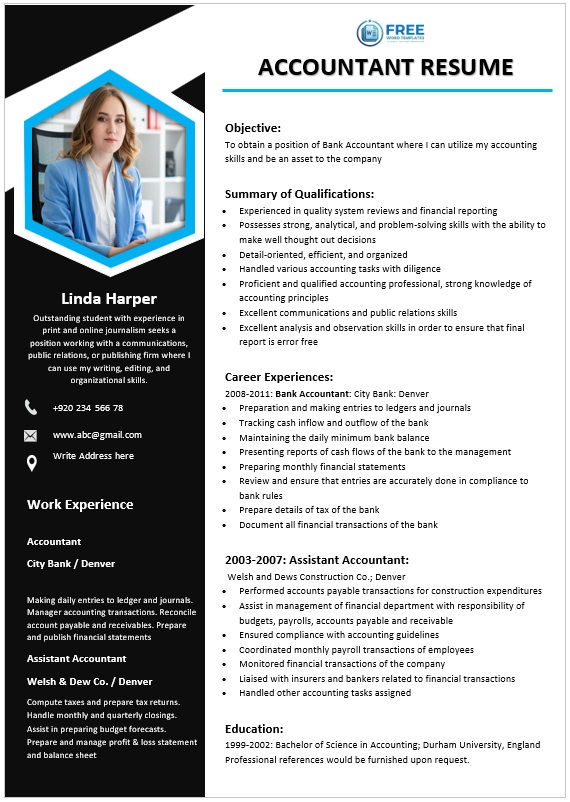
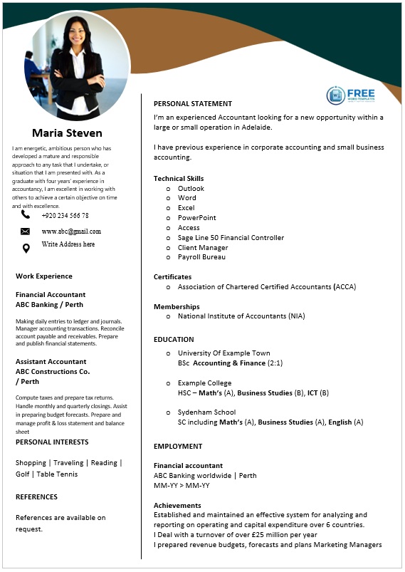
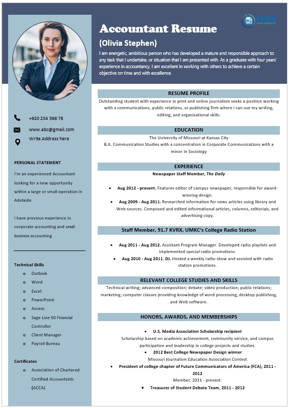
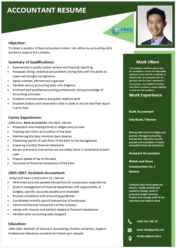
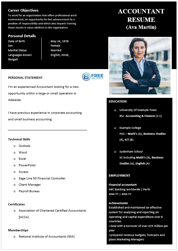
Each template below is editable in Word. Replace the content, set your accent colour, and export as a PDF for sending.
Keep Two Files
This is the practical answer to the whole ATS problem, and it removes the compromise rather than managing it.
File one: the clean version. Single column, standard headings, no text inside graphics, no tables, no icons carrying meaning. This is what you upload to job boards, company portals and recruitment systems. It looks tidy rather than striking, and that’s fine — nothing is judging its beauty at that stage.
File two: the designed version. Your full creative layout. This goes in direct emails to a named person, on your portfolio site, into your LinkedIn featured section, and into the room at interview as a printed copy. Here the design does its work, seen by a human with no parser in between.
Same content in both, updated together. It takes an extra twenty minutes once and it means you never have to choose between getting through a system and looking like you can design.
If you only keep one file, keep the clean one. A plain resume that reaches a recruiter beats a beautiful one that doesn’t.
ATS, Accurately
An applicant tracking system is the software an employer uses to collect, store and search applications. Two things are commonly misunderstood about it, and both matter here.
It mostly doesn’t reject anyone automatically. An ATS is largely a database with a search function: a recruiter searches for candidates with a particular skill, tool or job title, and reads what comes back. The widely repeated claim that most resumes are auto-rejected by robots is not an accurate description of how these systems are typically used.
The real risk is parsing, not rejection. If the software can’t read your file properly, your details go into the database garbled or missing — so when a recruiter searches for “UX research” you aren’t in the results, even though you have five years of it. You weren’t rejected; you were never found.
What actually causes parsing problems:
- Text inside images. A name or a section heading saved as a graphic is invisible to the parser. This is the single biggest cause of a resume arriving blank.
- Multi-column layouts, which can be read straight across rather than down each column, scrambling the content into nonsense.
- Tables, especially nested ones, which can be flattened in unpredictable order.
- Text boxes, which are sometimes skipped entirely.
- Headers and footers — contact details placed there may never be read. Put your phone and email in the body of the document.
- Decorative bullet characters and icon fonts, which can come through as symbols or as nothing.
- Unusual section headings. “Where I’ve Been” is charming and unparseable; “Experience” is boring and works.
File format: send a PDF unless the advert asks for Word, and make sure the text is selectable — open the PDF, press Ctrl+A, and check the words highlight rather than the whole page turning into one block. If nothing highlights, your resume is a picture.
Keywords: use the actual words from the job advert for tools, skills and titles, because that’s what a recruiter will search for. Write them into real sentences about what you did rather than listing them — keyword stuffing doesn’t help with the search and reads badly to the person who opens the file.
A free way to test it: open your PDF, select all, copy, and paste into a plain text document. What you see is roughly what the parser sees. If sections are out of order, half the content is missing, or your name isn’t there, fix those things before sending it anywhere.
Design: Type, Colour, Layout
Typography. Two typefaces at most — one for headings and your name, one for body text. Body copy at 10 to 12 point, headings at 14 to 18. Keep line spacing around 1.4 to 1.5 so the page breathes. Avoid script and display faces for anything other than your name, and embed fonts when exporting so the layout doesn’t rearrange itself on someone else’s machine.
Colour. One accent colour plus a neutral for body text. The accent goes on your name, section headings and perhaps a thin rule — not on large blocks behind text, which hurts both legibility and printing. Keep strong contrast: dark text on a light ground survives a bad office printer, a phone screen, and a recruiter squinting at it between meetings. Reversed-out text and gradients look excellent on screen and frequently print badly.
Layout. Lead with a clear header — name, professional title, contact details, portfolio link. Follow with a short summary, then experience, education and skills in an order that matches what the job advert prioritises. Use white space as the main organising device rather than lines and boxes; alignment does more for a design than decoration does. If you use a sidebar, keep genuinely important content out of it for the clean version, and remember that two columns are where parsers most often go wrong.
Length. One page for under ten years’ experience, two beyond that. A creative layout is not a reason to run to three.
What to Leave Off
- Skill rating bars. What does 80% Photoshop mean? Nobody knows, including you. Say what you built with it instead.
- A photograph, unless it’s expected where you’re applying. In the UK and US it’s normal to omit it, and some employers strip photos to reduce bias.
- Personal details — date of birth, marital status, full home address. A city and country is enough.
- Every job since school. The last ten to fifteen years, with earlier roles condensed to a line.
- “References available on request.” Assumed, and it wastes a line. Keep a separate reference list ready instead.
- Long paragraphs. Bullet points beginning with a verb and containing a result. “Redesigned the checkout flow, reducing abandonment by 18%.”
- Anything you can’t discuss at interview.
Also worth having ready: a matching cover letter in the same typeface and accent colour, which makes the application look considered before anyone reads a word.
More resume designs: modern resume templates for a cleaner contemporary style, and our full resume collection for traditional formats.
Frequently Asked Questions
What is a creative resume?
A resume that uses layout, colour, typography and sometimes graphics to show design sensibility alongside the usual career information. It suits roles judged on visual work and is a liability in conservative fields.
Do creative resumes get rejected by ATS?
Not usually rejected — but frequently misread. Applicant tracking systems are mostly databases recruiters search, so the risk is that your details are parsed badly and you don’t appear in results. Text inside images, multi-column layouts and text boxes are the common culprits.
Should I send a PDF or a Word file?
PDF unless the advert asks for Word, and make sure the text is selectable. Open the PDF, press Ctrl+A, and check that individual words highlight — if the whole page highlights as one block, it’s an image and unreadable to any parser.
How do I keep a creative resume ATS-friendly?
Keep two files: a clean single-column version for online applications, and your designed version for direct emails, your portfolio and interviews. Same content, two presentations, no compromise in either.
Which industries should avoid creative resumes?
Finance, law, accountancy, healthcare, engineering, government, academia and most large corporate and graduate recruitment. There a designed resume reads as unfamiliarity with the convention rather than as creativity.
Should I include a photo on my resume?
In the UK and US, generally not — it’s not expected and some employers remove photos to reduce bias. In parts of Europe, Asia and the Middle East it’s conventional. Follow the norm where you’re applying.
Are skill rating bars a good idea?
No. A bar showing 80% Photoshop conveys nothing measurable, and reviewers discount them. Name the tools plainly and let your experience bullets show what you did with them.
How long should a creative resume be?
One page up to around ten years’ experience, two after that. A visual layout isn’t a reason for extra pages — the portfolio carries the depth.

Pete Smith is a Business Management graduate and a passionate advocate for practical, accessible resources that empower professionals and entrepreneurs to succeed. With a strong foundation in organizational strategy and operational efficiency, Pete combines academic knowledge with real-world insights to simplify complex business processes. He is the creator behind a growing online platform dedicated to offering free, high-quality documents, templates, and actionable tips designed to save time and improve productivity.