A modern resume is a clean, single-column document that a recruiter can read in a hurry and recruitment software can read at all. It uses restrained typography, one accent colour, and plenty of space — and it puts the work into the wording rather than the decoration. The free templates below are editable MS Word files, and beneath them you’ll find the layout rules, accurate guidance on applicant tracking systems, and worked examples of the thing that actually decides whether a resume works.
What Makes a Resume Modern
Six things, and none of them is decorative:
- A clean sans-serif typeface — Calibri, Inter, Helvetica, Arial or your system default. Body text at 10 to 12 point, your name at 20 to 24.
- One accent colour, used on your name, section headings and perhaps a thin rule. Navy, charcoal, deep teal or muted green all work.
- Generous white space — margins of around one inch, and a clear gap between each section and each role.
- Obvious hierarchy: name largest, then section headings, then job titles, then dates and company names.
- A single column for the main content, which reads better on a phone and parses reliably.
- Achievement-led bullets with numbers in them. This is the one that matters.
Recruiters give a resume a very short first look before deciding whether to read it properly. You don’t need a precise figure to design for that — you need the top third of page one to answer who you are, what you do, and what you’ve achieved, without anyone having to hunt.
The Part That Matters Most: Your Bullets
Most resume advice is about design. Most resumes fail on wording.
The commonest mistake is describing duties rather than results — writing the job description you were given instead of what you actually did with it. Compare:
| Duty — what most people write | Result — what gets read |
|---|---|
| Responsible for managing the company’s social media accounts | Grew Instagram following from 4,200 to 31,000 in 14 months, driving 22% of Q3 online sales |
| Handled customer complaints and escalations | Reduced average complaint resolution from 9 days to 2, cutting repeat contacts by a third |
| Worked on the website redesign project | Led the checkout redesign across a team of four, reducing cart abandonment by 18% |
| Duties included training new staff | Trained 11 new starters over two years; all but one still with the company |
| Assisted with monthly reporting | Rebuilt the monthly report in Excel, cutting preparation from two days to three hours |
The formula underneath: strong verb + what you did + the result, with a number. Led, rebuilt, reduced, launched, negotiated, trained, recovered — not “responsible for”, “involved in”, or “duties included”.
If you don’t have numbers, look harder before giving up. How many people, how often, how much, how long, how many fewer complaints, how much faster. Almost every job has quantities attached to it; most people simply never wrote them down. Where a figure is genuinely unavailable, name the scale instead: “for a team of 30 across three sites” tells a reader more than no context at all.
Three to five bullets per role, fewer for older jobs. And lead with your strongest, because the later ones may not be read.
Core Design Principles Behind Modern Templates
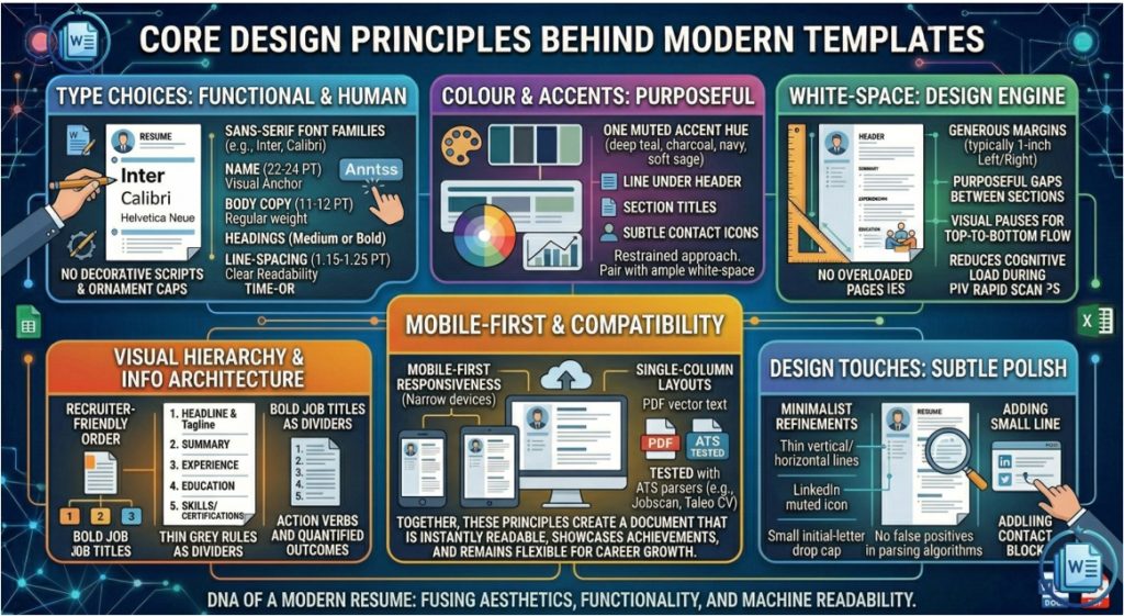
A truly modern resume balances form and function: it employs a sans-serif typeface such as Inter, Calibri, or system fonts to guarantee legibility across devices; it reserves color for a single accent—often a muted teal, navy, or charcoal—applied sparingly to headings or a subtle line separator, thereby signaling personality without overwhelming the content. Generous white-space separates each section, allowing achievements and metrics to breathe and making the document scannable on both desktop and mobile screens. Visual hierarchy is achieved through purposeful sizing: the candidate’s name dominates the header, section titles are bolded, and job titles stand out from company names and dates. Finally, modern resumes remain adaptable, offering easy editing in Word, Google Docs, or Canva and providing a clear path for ongoing updates, ensuring the document evolves alongside the professional’s career trajectory.
Free Modern Resume Templates in MS Word
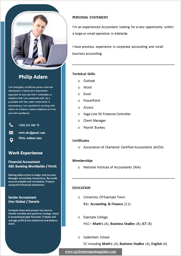
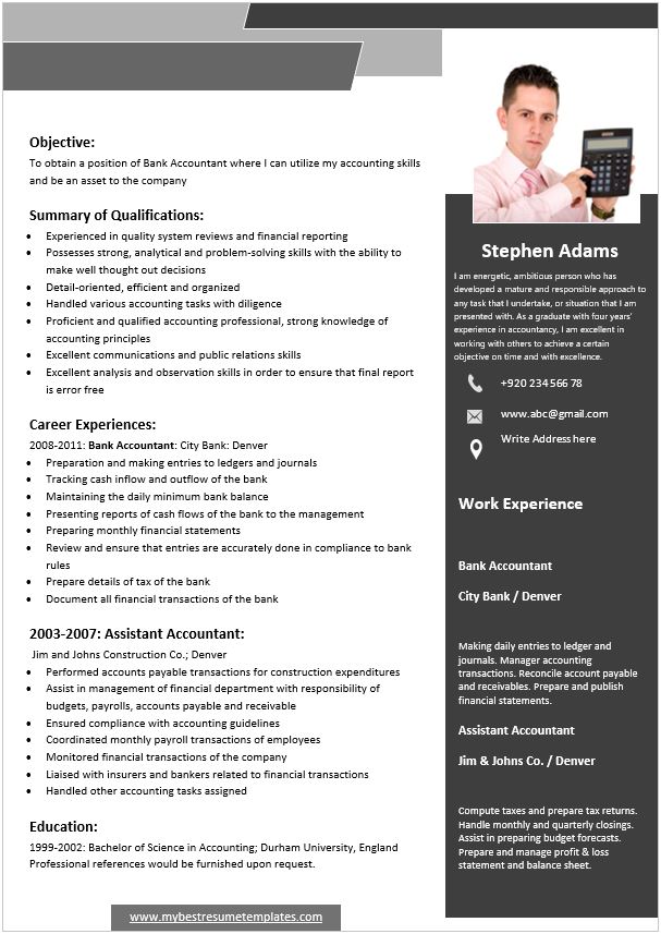
Each template below is editable in Word. Replace the content, set your accent colour, and export as a PDF with fonts embedded.
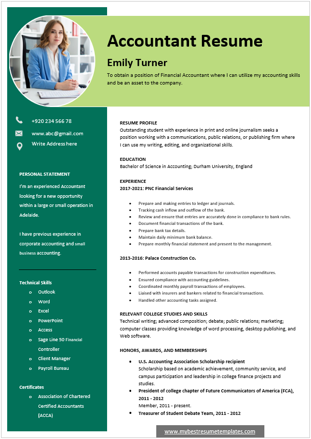
Professional Modern Resume Template Word
File Size: 481 KB
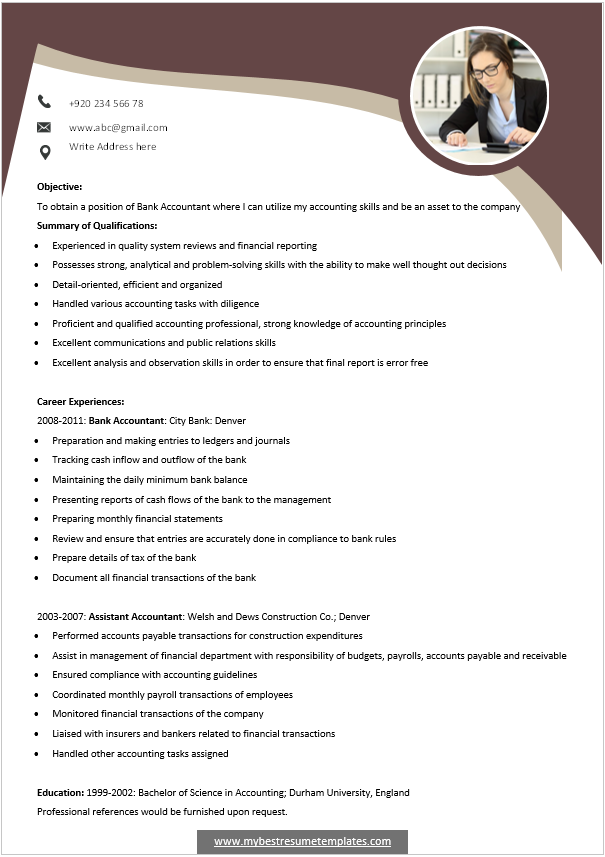
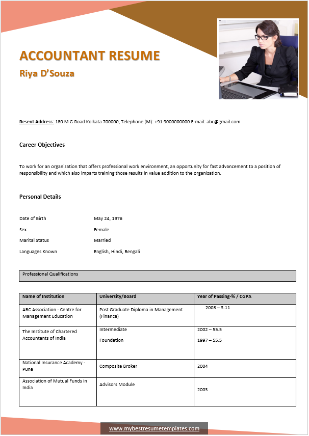
Layout and Typography
- One typeface, two at most. A single sans-serif in two or three weights looks more considered than two families.
- Body copy 10–12pt, name 20–24pt, headings 13–16pt. Below 10pt is unreadable on paper; above 12pt wastes the page.
- Line spacing 1.15 to 1.25. Tighter looks cramped, looser looks padded.
- Margins around one inch. If you’re reducing margins to fit, cut content instead.
- One accent colour, on the name, headings and rules. Not as a block behind text, which hurts legibility and printing.
- Thin grey dividers rather than boxes or shaded panels.
- Left-align everything. Justified text creates uneven word spacing; centred body text is hard to scan.
- Be consistent with dates — one format, right-aligned or in a fixed position, so a reader can follow the timeline down the page.
ATS, Accurately
An applicant tracking system is the software employers use to collect, store and search applications. Two things are commonly misunderstood.
It’s mostly a database, not a judge. Recruiters search it for candidates with a particular skill, tool or job title and read what comes back. The widely repeated claim that most resumes are automatically rejected by software isn’t an accurate description of how these systems are generally used.
The real risk is being parsed badly. If the software reads your file incorrectly, your details land in the database garbled or missing — so when a recruiter searches for your main skill, you don’t appear. You weren’t rejected; you were never found.
What causes that:
- Text inside images — invisible to the parser, and the biggest single cause of a blank profile.
- Two-column layouts, which can be read straight across instead of down each column.
- Tables and text boxes, which may be flattened out of order or skipped.
- Contact details in the header or footer, which many parsers ignore. Put your phone and email in the body of the document.
- Unusual section headings. “Where I’ve Been” is charming and unparseable; “Experience” works.
- Decorative bullet characters and icon fonts.
File format: send a PDF unless the advert asks for Word, and check the text is selectable — open it, press Ctrl+A, and confirm individual words highlight rather than the whole page turning into one block. Embed fonts on export so the layout holds on someone else’s machine.
Keywords: use the actual words from the job advert for tools, titles and skills, written into real sentences about what you did. That’s what a recruiter searches for. Stuffing a list at the bottom doesn’t help the search and reads badly to whoever opens the file.
Test it free: open your PDF, select all, copy, and paste into a plain text editor. That’s roughly what the parser sees. If sections are out of order, content is missing, or your name isn’t there, fix it before applying anywhere.
If you want a more designed version as well, our creative resume templates page covers the two-file approach — a clean version for portals, a designed one for direct emails and interviews.
Section Order and Length
Standard order: name and contact details, a two or three line summary, experience in reverse chronological order, education, then skills and certifications. Put whatever the job advert prioritises highest — a technical role may want skills above education; a graduate application puts education first.
The summary should say what you do, roughly how long you’ve done it, and one thing you’re known for. Three lines. Not an “objective” explaining what you want — the employer is reading to find out what they get.
Length: one page under about ten years’ experience, two pages beyond. Two well-filled pages beat one cramped page in six-point type, and three pages needs a strong reason.
Older roles can be compressed to a single line each once they’re more than fifteen years back, or grouped under “Earlier career”.
Tailor it. The same resume sent to thirty employers performs worse than fifteen versions adjusted to the advert. Changing the summary and reordering your bullets takes ten minutes and matters more than any template choice.
What Makes a Resume Look Dated
- An objective statement — “Seeking a challenging position where I can utilise my skills.” Replaced by a summary of what you offer.
- “References available on request.” Assumed. Keep a separate reference list ready instead.
- A full home address. City and country is enough, and safer.
- Date of birth, marital status, nationality — unnecessary in the UK and US, and something many employers would rather not see.
- Skill rating bars. What does 80% Excel mean? Nobody knows. Name the tools and let the bullets show the level.
- Duty-based bullets starting “Responsible for”. Covered above, and the most damaging item on this list.
- Every job since school, with equal space given to a Saturday job from 2004.
- Dense unbroken paragraphs under each role.
- A photo, unless it’s conventional where you’re applying.
- Decorative fonts and heavy borders, which read as an early-2000s template rather than as personality.
Also worth preparing: a matching cover letter in the same typeface and accent colour. For other styles, see our creative resume templates and the full resume collection.
Frequently Asked Questions
What is a modern resume?
A clean, single-column document using a sans-serif typeface, one accent colour, generous white space and clear hierarchy — with achievement-based bullets rather than lists of duties.
What should a resume bullet point look like?
A strong verb, what you did, and the result with a number: “Reduced average complaint resolution from 9 days to 2, cutting repeat contacts by a third.” Avoid “responsible for”, “involved in” and “duties included”.
What if I don’t have numbers for my achievements?
Look harder first — how many people, how often, how much, how long, how much faster. Most jobs have quantities nobody wrote down. Where a figure genuinely doesn’t exist, give the scale instead: “for a team of 30 across three sites”.
Are modern resume templates ATS-friendly?
The single-column ones are. Risk comes from text inside images, two-column layouts, tables, text boxes, and contact details placed in the header or footer. Applicant tracking systems are mostly searchable databases, so the danger is being parsed badly and never appearing in results.
Should I send my resume as PDF or Word?
PDF unless the advert asks for Word. Check the text is selectable — open the file, press Ctrl+A, and make sure individual words highlight rather than the whole page. If not, it’s an image and no parser can read it.
How long should a resume be?
One page up to around ten years’ experience, two beyond that. Two well-spaced pages read better than one page in tiny type, and older roles can be condensed to a line each.
What font size should a resume use?
10 to 12 point for body text, 13 to 16 for headings, and 20 to 24 for your name, with line spacing of 1.15 to 1.25. If you’re shrinking the type to fit, cut content instead.
Should I include a photo on my resume?
Generally not in the UK or US, where it isn’t expected and some employers remove photos to reduce bias. In parts of Europe, Asia and the Middle East it’s conventional — follow the norm where you’re applying.

Pete Smith is a Business Management graduate and a passionate advocate for practical, accessible resources that empower professionals and entrepreneurs to succeed. With a strong foundation in organizational strategy and operational efficiency, Pete combines academic knowledge with real-world insights to simplify complex business processes. He is the creator behind a growing online platform dedicated to offering free, high-quality documents, templates, and actionable tips designed to save time and improve productivity.